
The section shows how Leads move through the stages of the Sales funnel: from first contact to deal. This is not just statistics on applications — it is an analysis of where money is lost and at which step the process fails.
1. Period selection (Выбор периода)
At the top of the section you set the analysis period: week, month, quarter, year, or a custom date range. After changing the period, all charts are rebuilt automatically.
Conversion always depends on time. A short period shows the current performance of managers; a long period shows the stability of the sales system. Without the correct period, numbers are easy to interpret incorrectly.
Recommendations:
- For quick monitoring, choose a week or a month to evaluate managers' performance;
- For long-term trend analysis — a quarter or more;
If metrics have changed sharply, the period helps to understand whether this is a one-time spike or a systemic problem.
2. Conversion between stages (Конверсия между этапами)
The conversion chart shows what percentage of Leads move from one stage to the next in your Sales funnel. In simple terms, it shows how many customers progress through the steps of your process. This helps quickly identify bottlenecks and understand where customers are lost and what requires attention.
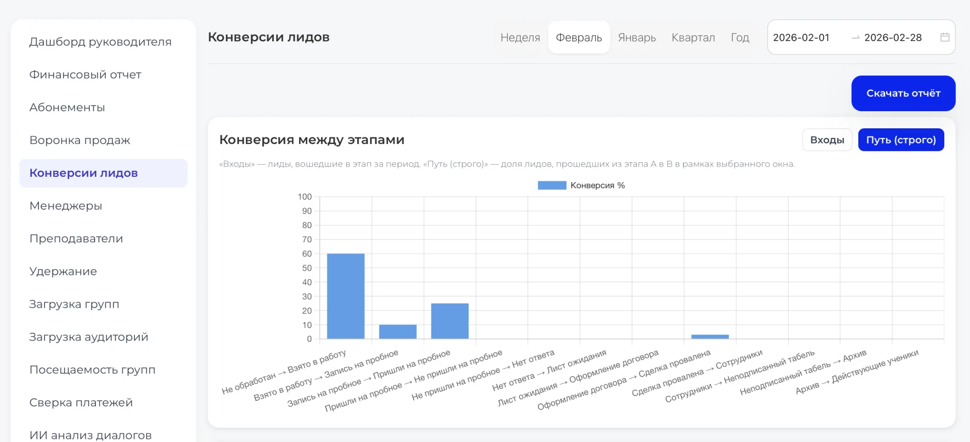
The horizontal axis displays the stages of the funnel, and the vertical axis shows the percentage of Leads that completed each transition, from 0 to 100%. Each bar reflects the share of customers who reached the next step.
For more precise analysis, two modes are available: "Entries" (Входы) and "Path (strict) (Путь (строго))". The first shows all Leads that entered a stage during the selected period, while the second calculates the percentage of those who actually moved from stage A to B during the chosen interval. The modes allow you to evaluate either the overall flow of Leads or specific transitions to identify problem points.
3. Distribution by stages (Распределение по этапам)
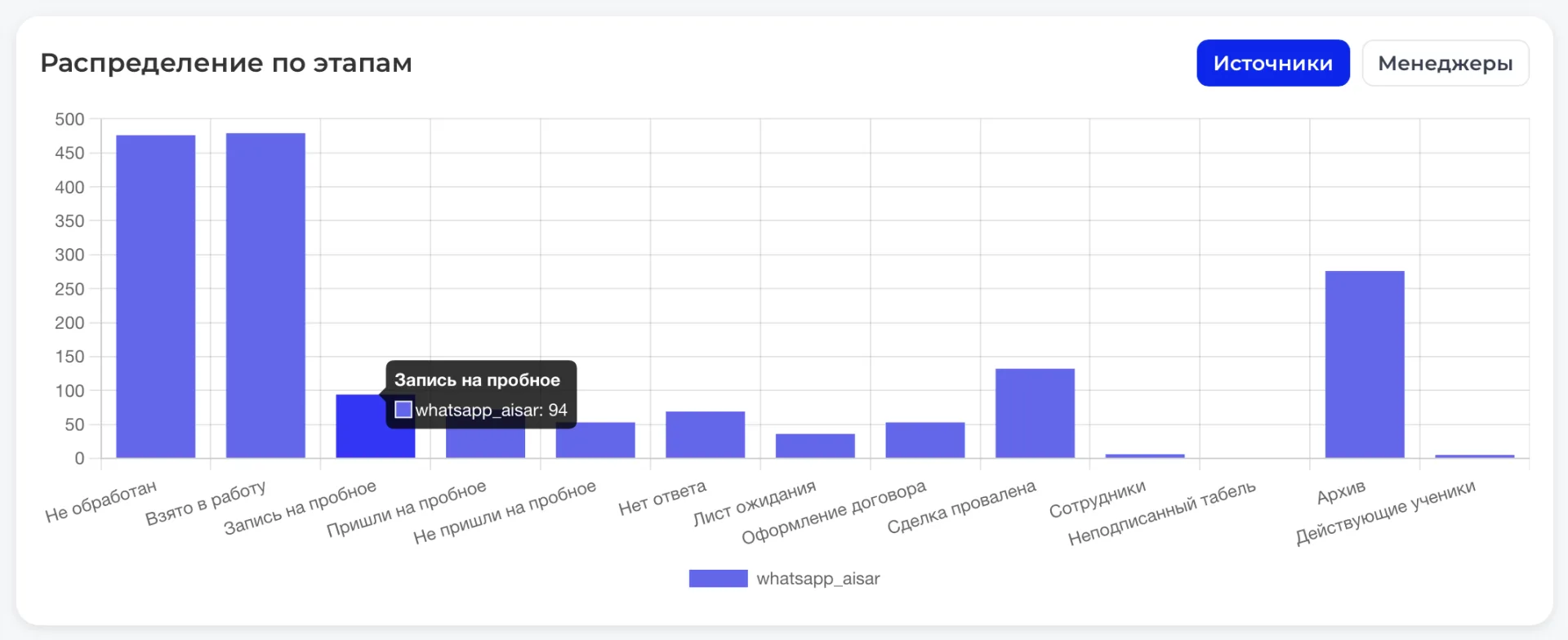
The "Distribution by stages" chart shows where your Leads currently are in the Sales funnel. It helps quickly understand where the process is "slowing down" and where everything is going smoothly.
What the chart shows
- Stages of the funnel along the horizontal axis — from "Lead qualification" to "Contract signing";
- Number of Leads on the vertical axis;
- Bars reflecting the actual distribution of Leads at each stage.
There are useful toggles:
- Sources — which advertising channel brought the Leads;
- Managers — who is responsible for each Lead.
When working with the chart, determine which stages have accumulated the most Leads.
Review distribution by managers and sources to redistribute tasks and the team's attention.
4. Conversion analytics and key metrics (Аналитика по конверсиям и ключевым показателям)
The top charts display conversions by sources and by managers — the share of Leads that successfully passed to the next stage of the funnel (A→B). Such analysis helps understand which advertising channels and which employees deliver real results.
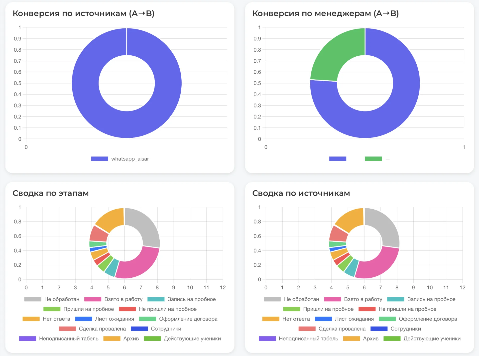
Below is a summary by stages and sources — these are ring charts showing the distribution of Leads across all stages of the funnel: from initial qualification and consultations to contract signing or decline.
Colors denote different stages.
This visualization makes it easy to see which funnel stages require intensified work.
5. Time to contract and trial conversions (Время до договора и конверсия пробных)

Under the charts, key time and trial lesson effectiveness metrics are shown:
- Average time to contract shows how many days on average pass from Lead to deal signing.
- Time to contract (p50/p75/p90) demonstrates the time distribution: the median and quartile values showing how quickly or slowly different groups of Leads progress.
- Trial conversion reflects the number of people who attended a trial Class and became clients within 30 days.

These metrics show how quickly Leads become clients and where delays occur. If the time to contract is long or trial conversion is low, you should improve managers' work, lessons, or communication with clients to speed up sales.
6. Key financial metrics (Ключевые финансовые метрики)
The bottom area contains the main financial indicators:
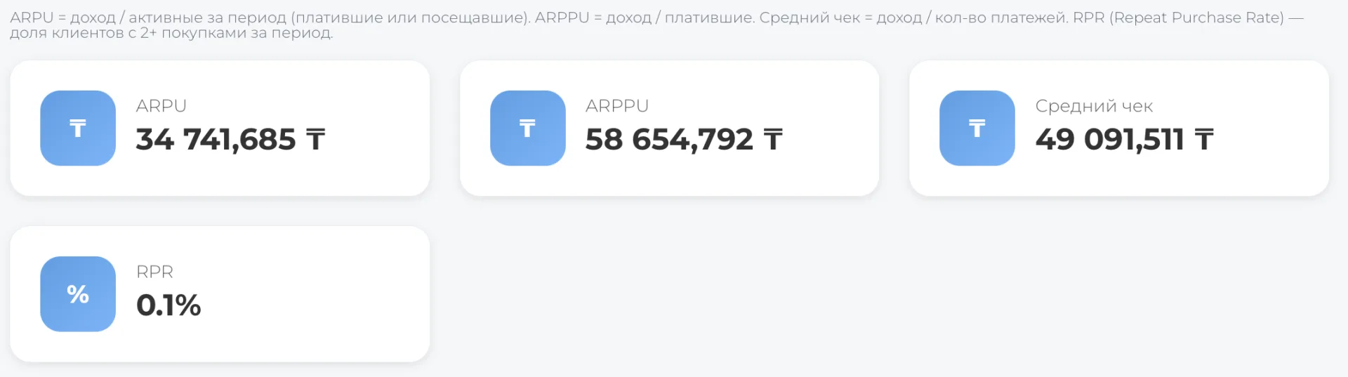
- ARPU (average revenue per active user) — the amount of revenue attributable to one active customer for the period. Helps understand how much each visitor or paying client brings on average.
- ARPPU (average revenue per paying user) — the average check for those who actually pay. This metric reflects how much clients value the center's services.
- Average check — the average amount of a single purchase or payment.
- RPR (Repeat Purchase Rate) — the share of clients who made repeat purchases (2 or more) during the period. This metric reflects loyalty and quality of retention.
The "Lead Conversions" section is your assistant in controlling and developing sales. It helps identify issues in client handling, evaluate channel and employee performance, and determine where support is needed.
Regular data analysis will quickly reveal bottlenecks, monitor the quality of work with trial clients, and enable informed budget decisions.
Use this tool daily — it will improve your sales and create a strong, well-coordinated team.