
1. Manager Dashboard (Дашборд руководителя)
At the top of the dashboard there are filters and a period selector that help you stay focused on the numbers and see only what matters.
Imagine opening reports and seeing thousands of rows of data for the entire year. It’s immediately unclear what to focus on and what conclusions to draw. Filters allow you to concentrate on the information you need.
- Period selection — week, month, quarter, year, or custom dates. Allows you to immediately view results for the period you are interested in without extra information.
- Filter by class type — all, group, or individual. You can evaluate what works better: individual lessons, group lessons, or the entire flow at once.
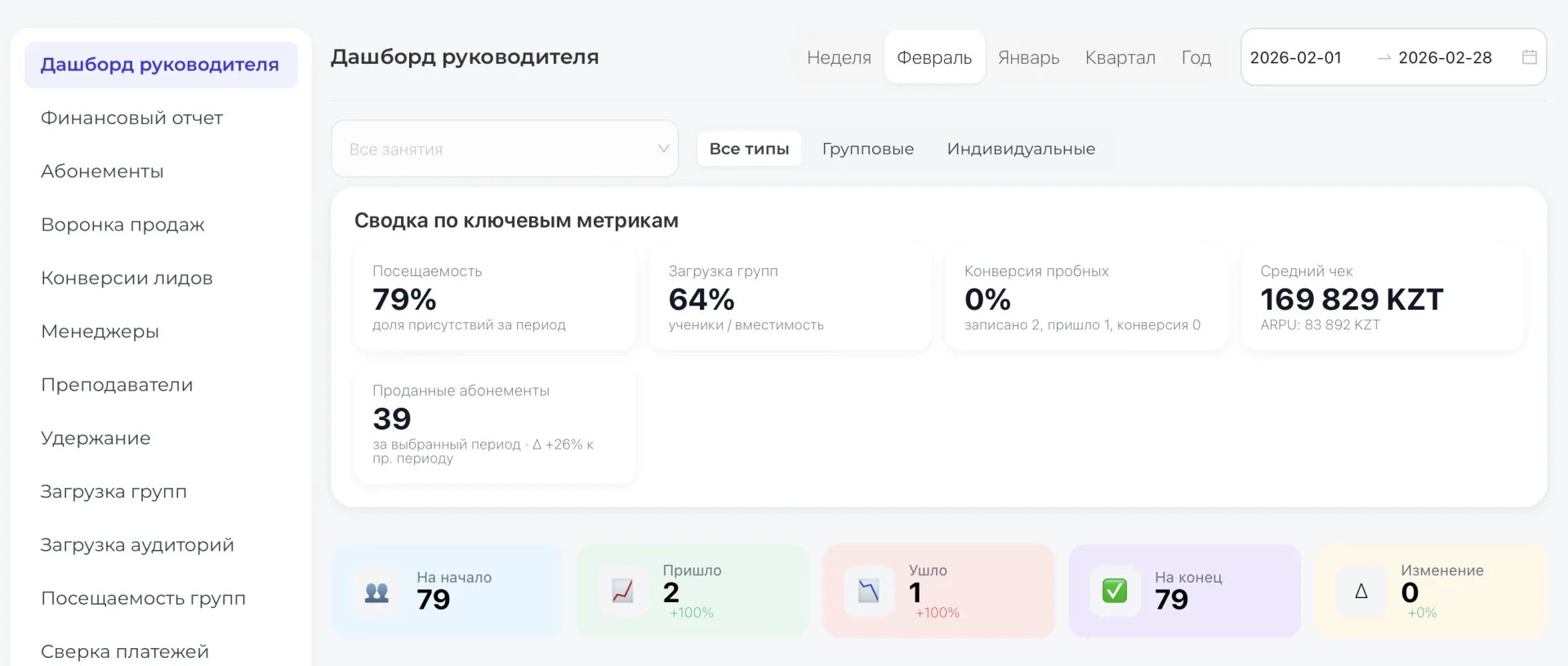
After selecting the desired filter, the dashboard updates automatically and shows only what you need. There is no longer a need to spend time on manual analysis or scrolling through long tables — the most important information is visible immediately.
2. Summary of key metrics
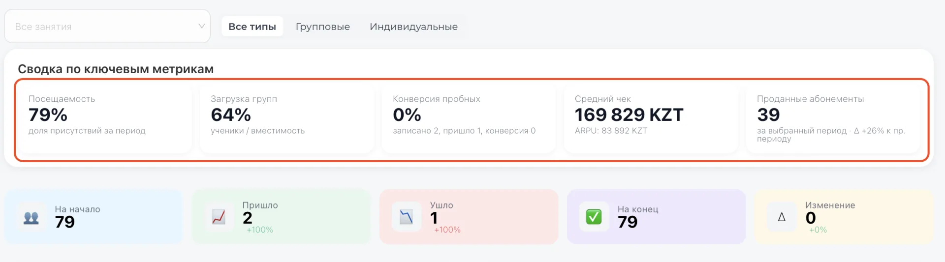
This block contains the most important numbers that help you quickly understand how things are going with clients and sales:
- Attendance (in %) — shows how many Students actually attended Classes during the selected period. If 100%, nobody missed classes; if lower, you can identify where clients are being lost and where to pay attention to motivation or reminders.
- Group capacity (in %) — shows how many seats in Groups are occupied. A low percentage can signal that groups are underfilled and some resources are idle, while a high percentage indicates that scheduling and enrollment are working effectively.
- Trial conversion (in %) — how many trial lessons converted into real Memberships. If the number is low, you need to check what happens during introductory lessons and how managers work with newcomers to avoid losing clients.
- Average check (in tenge) — the average amount paid by one client. Helps understand how much each Student brings in and where there is potential to increase Income.
- Memberships sold (count) — the total number of Memberships sold during the period. This indicator shows the real result of the team’s work and helps track sales dynamics.
3. Core client movement indicators
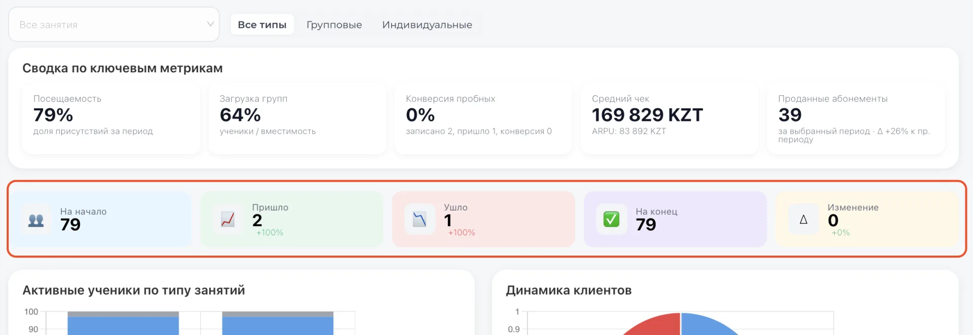
This block gathers key figures that show how the client base changes over the selected period. They help understand what is happening with your Students and where Income may be lost.
- At the start — how many Students there were at the beginning of the selected period. This number sets the starting point so you can see where you began.
- Arrived — how many new Students joined during the period. Helps evaluate how successful enrollments and trial lessons are.
- Left — how many Students stopped attending Classes. If this number grows, you should investigate why clients leave and where timely intervention is needed.
- At the end — how many Students remained at the end of the period. Shows the actual outcome of the team’s work and retention effectiveness.
- Change — the difference between start and end. Shows whether the client base is growing or shrinking. You can immediately see how well current processes work.
4. Charts
This section presents two types of charts:
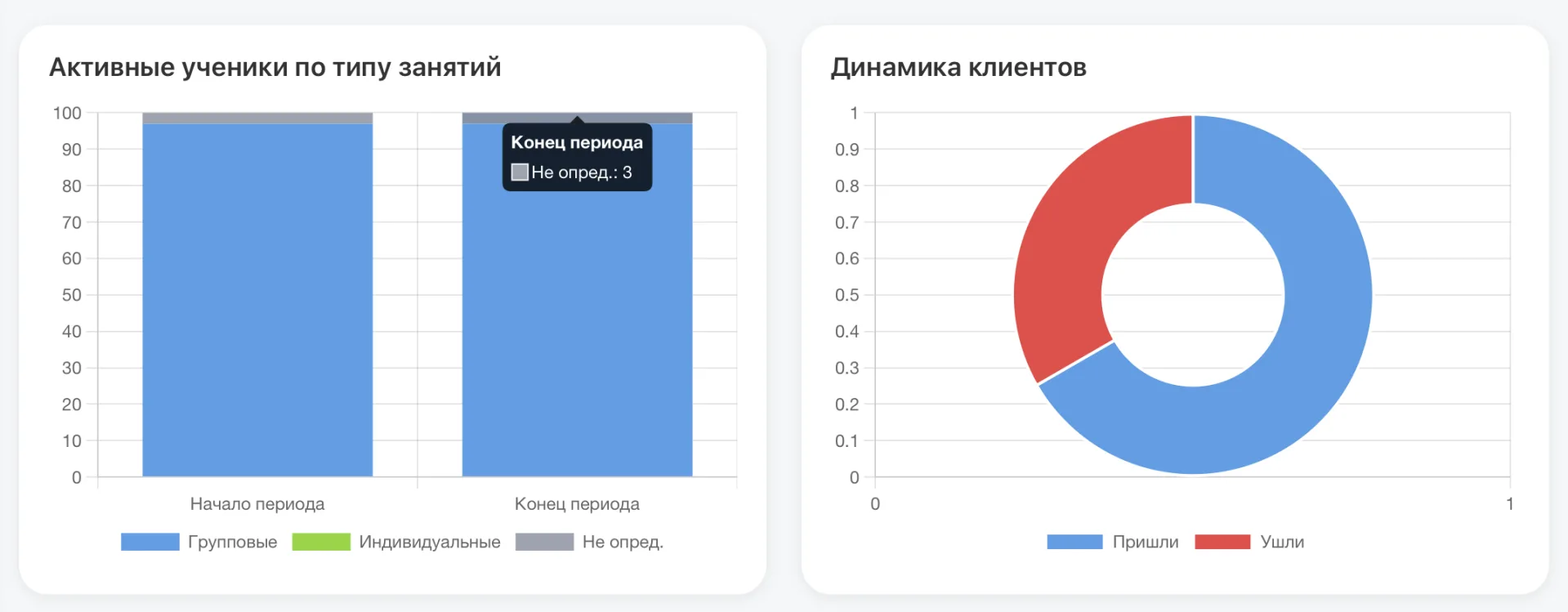
1.1 Active Students by class type
Here you can see how many Students attend Groups, how many attend individually, and how many are undefined. Categories are shown below the histogram and marked with different colors. Display of the chart can be adjusted by striking out an unnecessary category. You can restore it with a second click. This helps understand which formats are more popular and where there is growth potential.
1.2 Client dynamics
The pie chart shows the ratio of Arrived and Left Students for the period. This gives a visual understanding of the balance between growth and losses. You can see the number of Arrived and Left Students by hovering the mouse over the corresponding segment.
5. Top employee of the period
Under the charts the system displays the name of the employee who showed the best results for the selected period. This helps recognize and motivate top performers. The built-in calculation system shows Income, percentage of utilization, and number of active Students (with dynamics relative to the previous period)
6. Income, Expenses, and Profit
Next are three key financial indicators:
- Income — how much money was received during the selected period.
- Expenses — how much money was spent.
- Profit — the difference between Income and Expenses.
This block helps quickly understand the financial result without opening a separate Finance report.
If there is Income but Profit is zero or low — you should pay attention to Expenses.
If there is no Income — it means there were no Payments in the selected period or the date filter is set incorrectly.
7. Leads → Contracts
This block shows how your Sales funnel works.
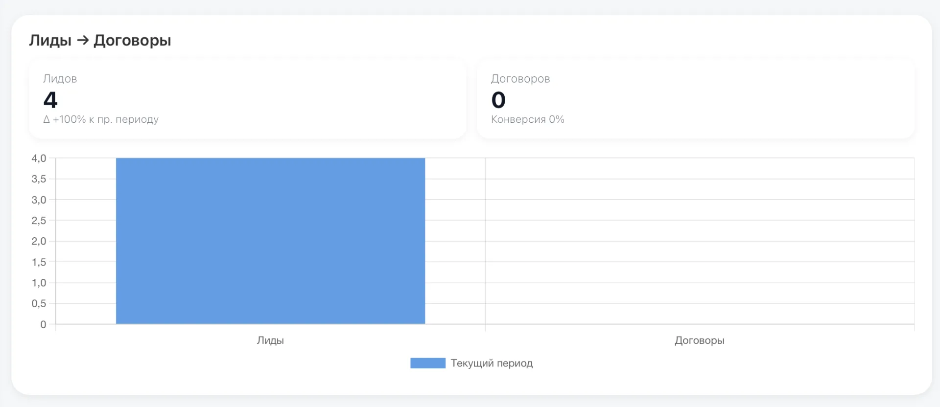
It reflects the following:
- Number of Leads — how many new inquiries were received during the period.
- Number of Contracts — how many of those inquiries turned into a Payment or a signed contract.
- Conversion (%) — what percentage of Leads became clients.
If there are many Leads but few Contracts — the problem may be in managers’ work or in the quality of inquiry handling.
If there are few Leads — pay attention to advertising and acquisition sources.
This block helps understand where sales are slipping: at the attraction stage or at the processing stage. Data is taken from the "Kanban" section
8. Average retention (M+1) and Attendance by months
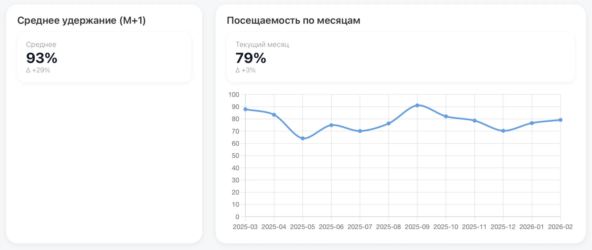
The retention metric shows how many clients continue attending in the following month.
If retention is low — clients are not staying after the first month.
This is a signal to check:
- class quality,
- feedback handling,
- Membership renewals,
- client communication.
Retention directly affects revenue stability. The higher the metric, the more predictable the Income.
The attendance-by-months chart shows how class attendance changed month to month.
Information about the chart:
- Horizontally (at the bottom) the months are indicated. This is the time scale — you see which values were recorded in which month.
- Vertically (on the left) the attendance percentage is indicated. The higher a point on the chart, the more Students attended Classes.
For example:
- If the line stays high — attendance is stable.
- If the chart drops sharply in a certain month — Students began to miss Classes more often.
If attendance drops sharply in a certain month — investigate the reasons: holidays, rescheduled Classes, cancellations, or decreased motivation among Students.
The chart helps see the trend, not isolated numbers.
10. Lists: arrived and left
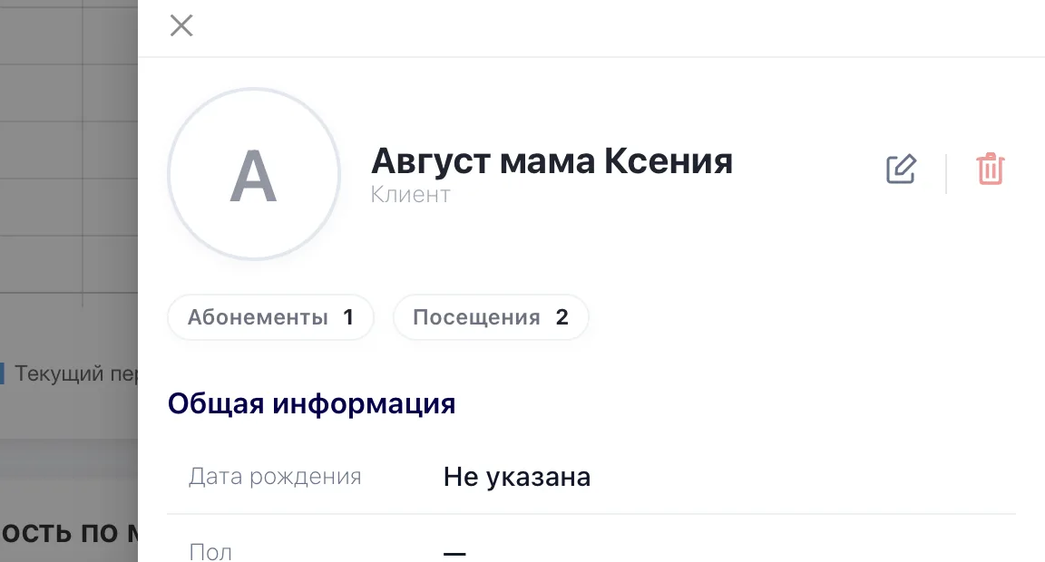
This block displays specific Students who started or stopped attending during the selected period; you can see not only counts but also names. This helps understand who exactly strengthened the client base and who left.

If the number of Students who left increases — you can quickly see which Groups they were from and start investigating the reasons.
For a deeper understanding of a Student’s details, you can click on the Student’s name and the system will show more information, where you can view the number of Memberships and Visits for that Student. This will help you understand whether that Student was a regular client or it was their first and only visit to your center (for example, a trial lesson).
Recommendations:
- Regularly select different periods to see growth or decline dynamics.
- Pay attention to trial conversion — if it is low, reconsider the quality of introductory lessons or managers’ work.
- Monitor Group capacity — if the percentage is low, consider marketing or schedule optimization.
- Use data about the top employee to reward and facilitate knowledge sharing within the team.
The Manager Dashboard helps quickly understand what is happening in the business right now. Without pages-long tables and long searches for the needed numbers.
If attendance drops, conversion falls, or Expenses grow, you see it immediately and can intervene in time. If metrics improve, you understand why and can scale the result.
This subsection saves time, reduces the risk of financial losses, and gives confidence in management. When key metrics are in front of you, decisions are made faster and more calmly.