The section shows the level of attendance of Classes and helps track month-to-month dynamics.
1. Period selection
At the top of the section you set the period for attendance analysis - 6 or 12 months. After changing the period the chart rebuilds automatically. Additionally, you can select a specific Class from the dropdown list.
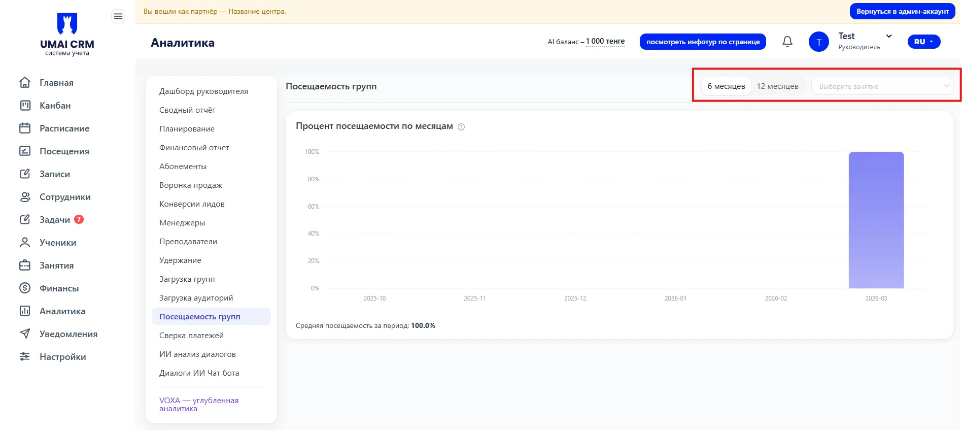
Choosing the period allows you to assess attendance trends in the short-term or long-term perspective.
2. Attendance chart
The chart displays the percentage of group attendance by month for the selected period:
- Horizontal axis — months.
- Vertical axis — attendance percentage.
- Blue bars – attendance value for each month.
At the bottom of the chart there is an indicator "Average attendance for the period" with the percentage specified.
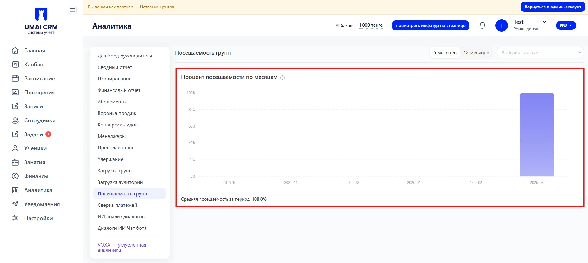
The chart helps evaluate overall attendance trends, identify declines or increases in metrics, and make decisions to adjust the Schedule or the work with the group.